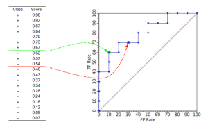
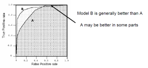
6 (Not So Easy) Steps to Work with Big Data in Your Low End Laptop

10-best-laptops_8z9p.640

I just got new experience working on “Big Data”, those term are the real term means that the data is very big and working on it in a low end laptop like mine (64bit processor and 4GB memory) is almost impossible.

Some of the competitions in kaggle for example, provide Gigs of data. Even more than 10 or 20GB. My laptop memory is not sufficient to see the sample of data in Excel or to load it in R. Other activities such as learning the data also consume a lot of memory because the algorithm will work iteratively to find the optimal parameter.

But, it doesn’t mean that we can not working on the data at all. I resume 6 step that I can do to deal with it. Please note that I use Large Text File Viewer, Sqlite and R. The method might also work if you decide other program that does similiar things such as MySQL and Python.

Step 1: I can’t load it with Excel, but I can read open it using Large Text File Viewer Program

Even if notepad is fail to load the data, Large Text Viewer is quite powerful program to replace it. The data in csv format for example will be read as text. This first step is important to see the field of the data to know the number of column in the table and type of field in each column.

GUI of LTF
GUI of LTF

Step 2: Load the program to sqlite

After the number of column and type of column is know, load the data into sqlite. The following command is an example how to load the data into sqlite, the column name is just a mock up.
Create the database

C:/thepath/tosavethefile>sqlite3 datadb.db
SQLite version 3.8.2 2013-12-06 14:53:30
Enter ".help" for instructions
Enter SQL statements terminated with a ";"
sqlite>

Create new table (ex:train) and load the train data into the table

sqlite> create table train(ID integer, label integer, i1 integer, i2 integer, t1 text, t2 text);
sqlite> .separator ","
sqlite> .mode csv
sqlite> .import train.csv train

Create new table (ex:test) and load the test data into the table

sqlite> create table test(ID integer, i1 integer, i2 integer, t1 text, t2 text);
sqlite> .separator ","
sqlite> .mode csv
sqlite> .import test.csv test

Check the number of rows in the table

sqlite> SELECT COUNT(*) FROM train;

Step 3: Load the partial data from sqlite to R

R is unable to load the entire data. The best way to do it is to load part of data, for example 10% of data, from sqlite to R using RSQlite library. Since the number of rows in the table is known, for example 30 millions row, 10% of the data is 3 millions.

Since we only take 10% of the data, we need to do following code 10 times and also step 4 10 times. The following code is for the first 10% of the data.

#load library
library(RSQLite)

#make connection
drv<-dbDriver("SQLite")
con<-dbConnect(drv,"datadb.db")

#select 10 percent of the data
train.data<-dbGetQuery(con,"SELECT * FROM train LIMIT 1,3000000")

The second 10% of the data will have this selection code

train.data<-dbGetQuery(con,"SELECT * FROM train LIMIT 3000001,3000000")

Step 4: Train the data in R and Save

Some data manipulation might be needed before the training began. After the data are ready, train the subset of data and save the model to use for later purpose. The following code shows when I train the data using linear model (regression)

lmmodel<-lm(count~.,data=train.data)
save(lmmodel,file="lmmodel1.rda")

Step 5: Ensemble Method

In the end, there will be 10 model. We need to load the model one by one. Since the model is very light, it won’t take much memory.

Load(“lmmodel1.rda”)

The ensemble method, such as what happened in Random Forest or Boost algorithm, is the averaging of all the variable in the model. In this case, the coefficient in the linear regression model.
If I run the model

lmmodel

I will get all the value of the coefficients. To get the average of each coefficient, we need to access each value of the coefficient, sum it and the divide it by 10. The following code show how to access the value of the coefficient of each variable.

lmmodel$coefficients["i1"]

Above is the example for i1 variable. Below is the example of the Intercept variable.

> lmmodel$coefficients["(Intercept)"]
(Intercept)
  -7.544367
 

Step 6: Test the data

The last step is the test step, where I load the test data and then find the label value based on the ensemble model. Suppose that the ensemble model is saved in “lmensemble”, then the following code is the prediction is the lable value.

First load the test data

</pre>

test.data<-dbGetQuery(con,"SELECT * FROM test ")
<pre>

Then predict the label.

predict.val<-predict(lmensemble,data.test,se.fit=TRUE)

Thats the wrap up. Feel free to comment.

Webscrapping : Counting Comment from Youtube Video

youtube_logo_detail

In the previous post, I said that I found difficulties to scrap the number of comment from Youtube video. Finally, with the help of a friend, I figure it out where to find the number of comments.

The number of comment can be find by interacting with the google API. Here is the link:

http://gdata.youtube.com/feeds/api/videos/VideoID

where Video ID is the ID of the video and can be obtained from the title_link, for example, each time I open a video from youtube, I got this link

https://www.youtube.com/watch?v=DmE14ul7h3k

The video ID is DmE14ul7h3k. By using XML path manipulation, I can obtained the number of comments by:

video.source<-getURL(“http://gdata.youtube.com/feeds/api/videos/DmE14ul7h3k")
video.xml<-htmlTreeParse (video.source,asText=T,useInternalNodes=T)
video.top<-xmlRoot(video.xml)
video.feedlink<-video.top[["body"]][["entry"]][["comments"]][["feedlink"]]
feedlink.attributes<-xmlAttrs(video.feedlink)
comment.count<-feedlink.attributes[[3]]

Here is the screenshot of the result for page on of the search result.

Image

The code can be obtained from my github here.

Webscraping (Youtube) using R

The abundant of data in the internet usually in the form of unstructured data, it means that the data is available for example as text in the webpage, or text in the file document. One way to collect the unstructured data is webscraping. Common programming language such as Python, Java, or R of course support webscraping. There are a lot of package build based on these language and are available for free to use.

I start to enjoy R programming language. The syntax is easy and it is pretty straightforward. It is perfect for noob programmer. I start the webscrapping practice by collecting the information about “Mahabharat” video in youtube. This movie serial is played everyday in one of national channel.

Untitled

For a start, search movie with certain keywords, in this case “Mahabharat 11th June 2014 full episode”. This search will produce a lot of pages of results. The webscraping will start from page one. The page one of the results will have this pattern

https://www.youtube.com/results?search_query=mahabharat+11th+june+2014+full+episode&search_sort=video_view_count&page=1

Note that the last part shows the page number. The next page search will just loop over this pattern and changing the page number. To do this, use the paste function. For example, start from page 1

page_num&lt<-1
site<-paste(front_url,page_num,sep="")

In theory, there are several code to get the page from “site”, the thing is some of the function does not work, such as the “readLines”. The “getURL” works. To use this, Rcurl library is used. XML library is also loaded to manipulate the source code of each page.

The information of search result in each page does not contain the number of viewer of the video, the duration of the video, number of like, number of dislike and number of comment. Those information obtained by open the each link of the video and get the source code. However, I find it difficult to get the number of comment because I have to interact with google API and this can’t be done yet by me.

Here is the result of the program when I just run one page of search result.

Result

Some difficulties that I found during the development of this code:

  1. Majority of the video page has same source format, some is different. I have to put conditional statement to get the number of like, dislike, view and the duration of the video
  2. The number of comment is not available in the source code. To obtain this, I have to interact with google API.

The full code can be obtained from my github page.

Playing with Dictionary in Java

java

Dictionary is one handy tools in programming. It map a keyword with certain value, just like real dictionary or data-base. Python has very powerful dictionary, it has many method that already embedded in it, such as if I want to sort and print the value based on the key, or based on the value. Because the dictionary is orderless, sometimes it is needed to save the result in a tuple list.

 dlist=sorted(data.items(), key=lambda x:x[1])

Above example is the code to sort the data based on the value (in this case based on x[1]) and save it in list of tuple dlist.

Java in the other hand, has library like dictionary, but I think it is not as powerful as python. When come to sort the dictionary based on the value, another function must be created to do this task. This was unexpected from a language as mature as java.

To try dictionary in java, I create a program that count number of words in a famous novel,and then print it based on most used words. In this program, the “stop words” was ignored and not shown in the calculation. “Stop-word” is a word that commonly used and usually not really meaningful, such as “the”.

The dictionary in Java is created using HashMap. Before it is created, the HashMap need to be defined in the beginning like any other variable. For example, I create Tdictionary freqs(show the number of frequency of the word)

Map<String,Integer> freqs=new HashMap<String,Integer>();

The map contain 2 data, the first is type of String, the word from the novel and the second is type of Integer, the number of the word used in the book.

As mentioned above, to sort the dictionary in Java is quite cumbersome, a function must be created to do this task. Below is the function called sortByValue that take input and return value as Map.

public static Map<String, Integer> sortByValue(Map<String, Integer> map) {
        List<Map.Entry<String, Integer>> list = new LinkedList<Map.Entry<String, Integer>>(map.entrySet());
 
        Collections.sort(list, new Comparator<Map.Entry<String, Integer>>() {
 
            public int compare(Map.Entry<String, Integer> m1, Map.Entry<String, Integer> m2) {
                return (m2.getValue()).compareTo(m1.getValue());
            }
        });
 
        Map<String, Integer> result = new LinkedHashMap<String, Integer>();
        for (Map.Entry<String, Integer> entry : list) {
            result.put(entry.getKey(), entry.getValue());
        }
        return result;
    }

You can see the complete program in my github.

Forecasting Using Exponential Smoothing Method

Exponential smoothing is a powerful method for forecasting. In this method, it is assumed that the value in time series data is not correlated with previous value.

In this small chapter, I will show how to use the exponential smoothing using Holt-Winters to make short term forecast. The data for this purpose was downloaded from here. All the modelling was done in R

First thing to do is of course to read the data, I use scan for this purpose. I know that this data contains monthly sales for a souvenir shop at a beach resort town in Queensland, Australia, for January 1987-December 1993 (original data from Wheelwright and Hyndman, 1998), so when I create the time series data, I can specify the start time of the series

> souvenir<-scan("fancy.dat")
Read 84 items

> souvenirtimeseries<-ts(souvenir,frequency=12,start=c(1987,1))

Frequency in the second command denote what is the frequency of the data in a year. 12 means that the data is shown monthly, while 4 means that the data will be shown quarterly. It is better to understand the data and what time it represent to avoid wrong time series representation.

I will plot the data in 2 dimensional plane to see how the data is changing over time.

Souvenir Time Series

We can see from this time series that there seems to be seasonal variation in the sales in one year. The sales is high in the end of the year and steady for the first 10 months each year. As seen in the plot above, the seasonal sales is changing over time, and the random fluctuations also seem to be change in size over time. Additive model cannot be used to explain this model. An additive model is a time series model where the observed value is an addition of its component. To make the model can be explained as additive model. For example, try to  transform the original data to its natural log.

> logsouvenirtimeseries<-log(souvenirtimeseries) > plot.ts(logsouvenirtimeseries)

log souvenir

The plot above, it can be seen that the seasonal change seems constant over time and the random fluctuations also seem constant. I may say that the log model is an additive model.

A seasonal time series like above consist of trend component,  a seasonal component and an irregular component. Decomposing time series means separating the time series into these three component, that is estimating the three component. To decompose seasonal data, use “decompose()” command in R.

> logsouvenirtimeseries.component<-decompose(logsouvenirtimeseries)

To see what is the return of the data, check the component by its name

> names(logsouvenirtimeseries.component)
[1] "x"        "seasonal" "trend"    "random"   "figure"   "type"

And see the plot

> plot(logsouvenirtimeseries.component)

Souvenir Component

The final part of this analysis is the forecasting. The method for forecasting is the Holt-Winters method.

> souvenirtimeseriesforecasts <- HoltWinters(logsouvenirtimeseries) > souvenirtimeseriesforecasts
Holt-Winters exponential smoothing with trend and additive seasonal component.
Call:
HoltWinters(x = logsouvenirtimeseries)
Smoothing parameters:
 alpha: 0.413418
 beta : 0
 gamma: 0.9561275

Coefficients:
           [,1]
a   10.37661961
b    0.02996319
s1  -0.80952063
s2  -0.60576477
s3   0.01103238
s4  -0.24160551
s5  -0.35933517
s6  -0.18076683
s7   0.07788605
s8   0.10147055
s9   0.09649353
s10  0.05197826
s11  0.41793637
s12  1.18088423

The estimated values of alpha, beta and gamma are 0.41, 0.00, and 0.96, respectively. The value of alpha (0.41) is relatively low, indicating that the estimate of the level at the current time point is based upon both recent observations and some observations in the more distant past. The value of beta is 0.00, indicating that the estimate of the slope b of the trend component is not updated over the time series, and instead is set equal to its initial value. In contrast, the value of gamma (0.96) is high, indicating that the estimate of the seasonal component at the current time point is just based upon very recent observations.

To see the result compared to the original data, plot both data in one plane, red as the forecast data and black is the original data

Holt Winter filtering

It can be seen that the Holt-Winters method is successful to predict the seasonal peak. It also can be seen that this method do not forecast future value, only predict based on the original data. To make forecast for future value, use “forecast.HoltWinters()” from library “forecast”. Suppose, it is needed to forecast the value for the next 48 months

> library("forecast")
> souvenirtimeseriesforecasts2 <- forecast.HoltWinters(souvenirtimeseriesforecasts, h=48)

And see the plot

> plot.forecast(souvenirtimeseriesforecasts2)

Holt Winter Forecast

The blue line is the forecast value while the dark grey and grey shows the 80% and 95% prediction intervals. To see the forecast value just type

> souvenirtimeseriesforecasts2
         Point Forecast     Lo 80     Hi 80     Lo 95     Hi 95
Jan 1994       9.597062  9.381514  9.812611  9.267409  9.926715
Feb 1994       9.830781  9.597539 10.064024  9.474068 10.187495
Mar 1994      10.477542 10.227856 10.727227 10.095680 10.859403
……(cutted for simplicity)
Oct 1997      11.806904 11.091167 12.522642 10.712278 12.901531
Nov 1997      12.202826 11.481562 12.924089 11.099748 13.305903
Dec 1997      12.995737 12.268989 13.722485 11.884272 14.107202

How to check if the model is good and do not need to be improved further? To do this, we need to check whether in sample forecast error show a non-zero autocorrelation at lags 1-20, by making the correlogram and do Ljung-Box test.

> Box.test(souvenirtimeseriesforecasts2$residuals, lag=20, type="Ljung-Box")
        Box-Ljung test
data:  souvenirtimeseriesforecasts2$residuals
X-squared = 17.5304, df = 20, p-value = 0.6183

ACF Error

The correlogram shows that the autocorrelations for the in-sample forecast errors do not exceed the significance bounds for lags 1-20. Furthermore, the p-value for Ljung-Box test is 0.6, indicating that there is little evidence of non-zero autocorrelations at lags 1-20.

A good model, ideally the error will follow normal distribution with mean zero. To see this, it is necessary to see the timeplot of forecast error and the histogram of the error.

To plot the histogram of the error overlaid with normal distribution, a function is created

plotForecastErrors <- function(forecasterrors)
  {
     # make a histogram of the forecast errors:
     mybinsize <- IQR(forecasterrors)/4
     mysd   <- sd(forecasterrors)
     mymin  <- min(forecasterrors) - mysd*5
     mymax  <- max(forecasterrors) + mysd*3
     # generate normally distributed data with mean 0 and standard deviation mysd
     mynorm <- rnorm(10000, mean=0, sd=mysd)
     mymin2 <- min(mynorm)
     mymax2 <- max(mynorm)
     if (mymin2 < mymin) { mymin <- mymin2 }      if (mymax2 > mymax) { mymax <- mymax2 }
     # make a red histogram of the forecast errors, with the normally distributed data overlaid:
     mybins <- seq(mymin, mymax, mybinsize)
     hist(forecasterrors, col="red", freq=FALSE, breaks=mybins)
     # freq=FALSE ensures the area under the histogram = 1
     # generate normally distributed data with mean 0 and standard deviation mysd
     myhist <- hist(mynorm, plot=FALSE, breaks=mybins)
     # plot the normal curve as a blue line on top of the histogram of forecast errors:
     points(myhist$mids, myhist$density, type="l", col="blue", lwd=2)
  }
 

And finally, see the results by

> plot.ts(souvenirtimeseriesforecasts2$residuals)
> abline(h=c(0))
 

error line

> plotForecastErrors(souvenirtimeseriesforecasts2$residuals)
 

error dist

From two plots above, it can be seen that the error roughly follow normal distribution with mean zero. Conclusion: The model is good and do not need to be improved further.

Disclaimer : Note that this content is not my original creation. I summarize the content from “a-little-book-of-r-for-time-series

Bayes Network and Modelling Likelihood in Python

I remember long ago, when I was an undergrad, I found difficulty to understand Bayes theorem, especially when there are many conditions and each condition was interconnected. I found it difficult about how it works. But now, couple years later, I see that Bayes theorem was quite fun, easy to understand and well, I will say, quite useful. I think I find this theorem easy to understand is when I was introduced to Bayes network.

Through wikipedia, the definition of Bayes network is “probabilistic graphical model (a type of statistical model) that represents a set of random variables and their conditional dependencies via a directed acyclic graph” . I could say that this is the marriage of probability theory and graph theory. See example below for the bayesian network on the effect of rain to other condition.

Image

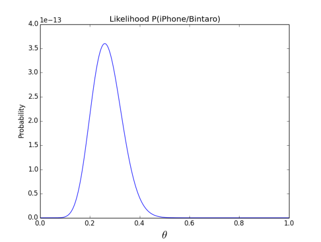
Related to bayes theorem, there is likelihood estimation. This likelihood estimation try to find the best possible probability from an actual data. Suppose from a survey of 50 person in Bintaro road, there are 13 people holding iPhone. What is the probability that people in Bintaro road has iPhone? This case follow a polinomial distribution. In bayes theorem, this question can be modelled as P(iPhone=T/BintaroRoad=T). Note that T in this model means ‘True’.  See that the probability is around 0.26.

Image

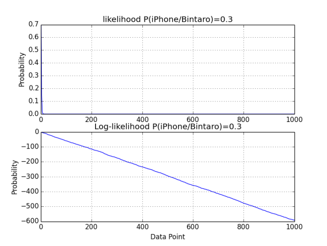
It may need necessary to see the plot of likelihood with fix probability. In this case, I will just fix the probability to 0.3. The plot of likelihood and loglikelihood can be seen here.

Image

The full code can be find here. By the way, can anybody tell me how to intrepreting the result? Well, it is clearly that using log value, the change of the MLE can easily being observer.

ROC Analysis in R

As mentioned from previous post, the function for ROC analysis is available in other programming language. In this post I just wanted to show how to plot the ROC and calculate the of auc using R. Since R is an open source language, there are several people who developed the ROC analysis package. One package that quite mature is ROCR. When writing code, ROCR library should be included

library(ROCR)

In this scenario, once again I use the credit scoring data from previous post. Using this data, I developed 4 models to classify which customer will turn out to be a good customer and which will turn out to be a bad customer. The models use different algorithm; logistic regression, SVM, (simple) decision tree and random forest.

The step to develop this model is standard. Preparing the data and split the data into 2 categories, train and test, is the first step. The model is then trained using the train data. For example, here is the code for logistic regreesion model

#learning from training
logitmodel<-glm(Class~.,data=train,family=binomial("logit"))

The model is then fitted to the test data to get the class prediction.

#predicting the test data
logitmodel.probs<-predict(logitmodel, test, type = "response")
logitmodel.class<-predict(logitmodel, test)
logitmodel.labels<-test$Class

The ROC curve analysis need the score(probability) whether the result will be 1(good) or 0(bad). The probability in above code is the logitmodel.probs. The other two code, logitmodel.class will produce the prediction 1 or 0, and logitmodel.lables is the actual class of customer. These results; logitmodel.class and logitmodel.labels are used to calculate the accuracy. To calculate the accuracy, another library called SDMTools needs to be loaded. This accuracy is calculated by creating the confusion matrix table and then calculate the correct proportion of correct predictioin.

logitmodel.confusion<-confusion.matrix(logitmodel.labels,logitmodel.class)
logitmodel.accuracy<-prop.correct(logitmodel.confusion)

To calculate AUC and ROC plot, the following codes are need to be executed

#roc analysis for test data
logitmodel.prediction<-prediction(logitmodel.probs,logitmodel.labels)
logitmodel.performance<-performance(logitmodel.prediction,"tpr","fpr")
logitmodel.auc<-performance(logitmodel.prediction,"auc")@y.values[[1]]

Finally, the plot for those four models will be created by R using this code

#COMPARING ROC PLOT of 4 Model#

windows()
plot(logitmodel.performance,col="red",lwd=2)
plot(svmmodel.performance,add=TRUE,col="green",lwd=2)
plot(treemodel.performance,add=TRUE,col="blue",lwd=2)
plot(rfmodel.performance,add=TRUE,col="black",lwd=2)
title(main="ROC Curve of 4 models", font.main=4)
plot_range<-range(0,0.5,0.5,0.5,0.5)
legend(0.5, plot_range[2], c("logistic regression","svm","decision tree","random forest"), cex=0.8,
   col=c("red","green","blue","black"), pch=21:22, lty=1:2)

The plot

ROC Plot

Which one is the best model. Because when creating this model, I do not make any fine tuning on the data and on the parameter of the model, it will be biases if I say that particular model is the best. But based on this initial result, I can check the value of accuracy and AUC of each model.

Logistic Regression

> logitmodel.accuracy
[1] 0.748
> logitmodel.auc
[1] 0.7745536

SVM

> svmmodel.accuracy
[1] 0.734
> svmmodel.auc
[1] 0.7665687

(Simple) Decision Tree

> treemodel.accuracy
[1] 0.71
> treemodel.auc
[1] 0.7124074

Random Forest

> rfmodel.accuracy
[1] 0.75
> rfmodel.auc
[1] 0.784816

It can be seen that Random Forest is the best model with accuracy 75% and auc value 0.7841816, while (simple) decision tree is the worst model with accuray 71% abd auc value 0.7124074.

Please note that different library are needed to develop the model. The logistic regression use the standard library, SVM model use e1071 library, (simple) decision tree use rpart library and the last one, random forest model using randomForest library.

The complete code and the csv file to play with can be found in my github.

A brief introduction to “apply” in R

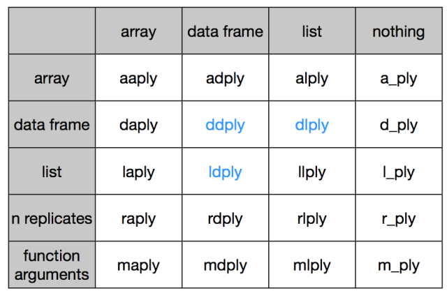
full_apply_suite

Good intro to ‘apply’ in R. See it and have fun.

What You're Doing Is Rather Desperate

At any R Q&A site, you’ll frequently see an exchange like this one:

Q: How can I use a loop to […insert task here…] ?
A: Don’t. Use one of the apply functions.

So, what are these wondrous apply functions and how do they work? I think the best way to figure out anything in R is to learn by experimentation, using embarrassingly trivial data and functions.

If you fire up your R console, type “??apply” and scroll down to the functions in the base package, you’ll see something like this:

Let’s examine each of those.

1. apply
Description: “Returns a vector or array or list of values obtained by applying a function to margins of an array or matrix.”

OK – we know about vectors/arrays and functions, but what are these “margins”? Simple: either the rows (1), the columns (2) or both (1:2). By “both”, we mean “apply the…

View original post 1,003 more words

AUC calculation made easy by Python

Related to previous post, there is a usefull and easy to use funtion in Python to calculate the AUC. I am sure that there is similar function in other programming language.  The basic code to calculate the AUC dan be seen from this link. I found two ways to calculate the AUC value, both of them using sklearn package.

The first code

sklearn.metrics.auc(x, y, reorder=False)

The second code is

sklearn.metrics.roc_auc_score(y_true, y_score)

Here is the example of AUC calculation based on german data using the first code.

 '''Sorted data'''    
 inputsorted='german-sorted.xlsx'
    datasorted=readxlsx(inputsorted)
    score_sorted=datasorted[0,:]
    act_class_sorted=datasorted[1,:]

    '''calculating ROC AUC'''
    fpr_sorted,tpr_sorted,thresholds_sorted=metrics.roc_curve(act_class_sorted,score_sorted,pos_label=2)
    aucvalue_sorted=metrics.auc(fpr_sorted,tpr_sorted)
    print 'AUC value of sorted data'
    print aucvalue_sorted
    print ''        

 '''Unsorted data'''
    inputunsorted='german-unsorted.xlsx'
    dataunsorted=readxlsx(inputunsorted)
    score_unsorted=dataunsorted[0,:]
    act_class_unsorted=dataunsorted[1,:]
    
 '''calculating ROC AUC'''
    fpr_unsorted,tpr_unsorted,thresholds_unsorted=metrics.roc_curve(act_class_unsorted,score_unsorted,pos_label=2)
    aucvalue_unsorted=metrics.auc(fpr_unsorted,tpr_unsorted)
    print 'AUC value of sorted data'
    print aucvalue_unsorted

Here is the result

AUC value of sorted data
0.769492857143

AUC value of unsorted data
0.769492857143

It is not surprising that the result of unsorted and sorted data is the same. These result also close to the calculation using excel.

Calc using Excel

The complete code for this calculation can be seen in my github page. The data can also be found in that folder.

Gini, ROC, AUC (and Accuracy)

In economics, it is common to read in newspaper about gini coefficient (Gini was taken from Italian sociologist who introduce this method). Often it is used by the government to report the economic condition of a country. It also sometimes cited by economic obsersver, researcher or someone in twitter to look more credible and smart (haha…kidding :)). What is gini coefficient anyway? First time I heard gini coefficient was when I took data mining and credit scoring class, then someone from economic background and now taking his PhD mention it slightly in mailing list.

I read that gini coefficient is related to ROC (Receiver Operating Characteristic). It is surprising that someone whom I knew from a website once mention about ROC to measure the performance of a classifier model. Usually this term emerge in classification or machine learning. To understand it better, I dig deeper about gini and ROC via any source.

Some terms that I will mostly use in this blog are ROC, AUC and Gini. ROC is a graphical plot which illustrates the performance of a binary classifier system as its discrimination threshold is varied (from wikipedia), while AUC is the Area Under ROC Curve. The last term, gini, is calculated by 1-2*AUC, in another source, it was calculated by 2*AUC-1.

In the paragraph I will write about the ROC and gini coefficient applied in different field that I understand.

1. Classification

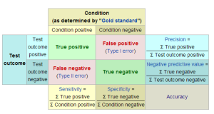
In binary classification, often a quality of a model is calculated by the term Accuracy. Before the accurary can be measured, one need to calculate the true positive (TP) and true negative rate(TN). True positive calculate the number of positive prediction provided that the actual value is positive. True negative calculate the number of negative prediction provided that the actual value is negative. The accuracy is then calculated by ACC=(TP+TN)/(P+N)=(TP+TNR)/(Total Data).

Contingency Table True Pos Neg wiki

The term of positive and negative in above paragraph is a common term for binary classification (2 class prediction). The value 1 and 0 also can be used. For example, in email, some email can be cateorized as not a spam and some others can be categorized as a spam. Not a spam is clasified as True or 1, while a spam is classified as 0 or negative.

Another method to measure the performance in binary classification beside accurary is the ROC method. Different from accuracy, ROC analysis uses the true positive rate (TPR) and false positive rate (FPR). TPR is the proportion positive correctly classified (TP/P) and  False positive rate (FPR) is calculated by 1-TNR (TN/N). The ROC region plot TPR against FPR.

ROC classification

Above is the example of ROC plot for classification model. Please remember that the ROC is used to evaluate the performance of a classifier model. The first thing to do before creating the ROC plot is of course creating the model. The iterative method of ROC development can be summarized into three step. Step 1 is developing the model that can produce a score for each individual data with based on all its variable. The score usually is the probability that this data will be postitive. Step 2 involves the data and its subsequent score is then ordered, usually in descending order (score). The last step is plot the ROC.

When observing the plot, if the plot follow the straight line from lower left to upper right, then the classifier cannot differentiate between negative and postive data. If the curve tend to bend to the upper left, then the model can differentiate the actual positive and negative data. On the contrary, if the curve tend to bend to lower right, then it just completely wrong prediction model.
To performance of a classifier model is then calculated by calculating the Area Under Curve (AUC). The AUC score will be between 0 and 1. The higher the value of AUC, usually the better the model is.

comparing model AUC
The AUC can be calculated by

AUC calculation

Gini calculation is closely related to the calculation of AUC and can be computed by Gini = 2*AUC-1

2. Credit Scoring

In financial industry, credit scoring is used to differentiate whether a potential customer will likely to be a bad customer (can not pay the loan) or good customer. So the problem that are faced in credit scoring is just the same as classification problem. But instead of plotting between TPR against FPR, it plotted the percentage of good customer against percentage of bad customer. Of course the percentage of good or bad customer is just a rename of TPR and FPR.

After building the model, the score (usually the probability of being good customer) is then calculated. Same with the classification problem, the data is then ordered. Unlike the classification, some people sometimes ordered the data in ascending order. The plot of the ROC will different with classification.

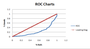
ROC credit

Example above is the ROC plot for the German credit card customer (by the way, if you curious with the data, contact me and I can provide you the copy). The way to read this data is a bit different with the classification where if the curve is bend towards lower right, the better the model to make accruate prediction, and vice versa.

Please note that in this credit scoring case, the data is ordered is ascending manner. If the data is sorted in descending order, the ROC curve will be just the same as the classification problem and also has the same way to intrepret it. The calculation of gini and AUC actually is just the same but just have slightly different representation.

Gini calculation

3. Economics

Taken from wikipedia, this term is a measure of statistical dispersion intended to represent the income distribution of nation’s residents. The Gini coefficient measure the inequality among values of a frequency distribution (like level of income). Gini coefficient of zero expresses perfect equality, for example, when all the residents has the same income. On the other hand, Gini coefficient of 1 (100%) express maximall inequality among values, for example when one person has all the income.
This number is calculated based on Lorentz curve. Unlike the above two examples, the ROC curve is plotted between the accumulated income in y axis against the percentage of the population. Of course the income data need to be sorted first, and in this case it is sorted in ascending order. Look at the diagram below for more clear vizualisation.
500px-Economics_Gini_coefficient2.svg
In this visualization, Gini value is measured by G=A/(A+B). By inspection, it can be seen that A+B=0.5, so gini values can also being calculated by G=2A or G=1-2*B. Please note that B also can be defined as AUC.

IMPORTANT NOTE: To everyone who ask for the DATA. I lost it. I am not sure where to find it. Really sorry.